
Janga Editora
Janga is a forward-thinking publishing company dedicated to offering readers books that are essential and transformative.
Overview
Inspired by the metaphor of a raft carrying only what truly matters, the brand aims to guide readers toward literature that captivates, challenges, and enriches. With a focus on trust, curiosity, and a touch of irreverence, Janga aspires to create a collection that feels both personal and universal. Its commitment to modern design and meaningful storytelling ensures a unique and memorable experience for a niche audience of curious, adventurous readers.

What We Did
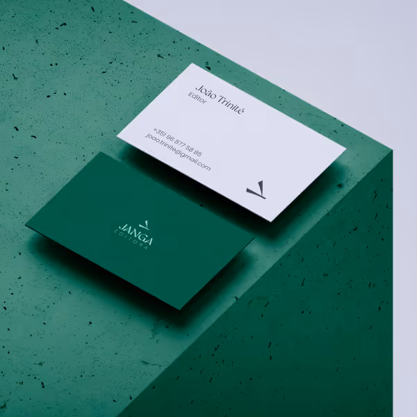
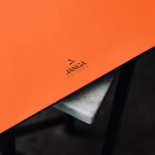
We designed a logomark that embodies the essence of a raft, symbolizing Janga’s core message of carrying only what truly matters. The typography complements this concept, echoing the simplicity and functionality of raft construction.
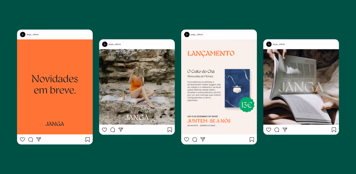
The color palette was thoughtfully developed, ranging from green—connecting the brand to its natural roots—to other hues that represent diverse literary genres. This balanced palette blends vibrant tones with soft shades, evoking confidence, energy, calmness, and creativity.
For Janga's first book, O Culto do Chá, we were responsible for creating the cover design, illustrations, and layout. These elements were crafted to reflect the brand’s vision of producing literature that is not only captivating but also visually inspiring.


You feel it too?
Let’s talk, no strings attached
And now you know Weedoo is right for you. Let's start up and scale your business - together.