
Otari
Otari is an AI gateway and centralised platform that gives developers greater control and visibility over their AI infrastructure. Connecting applications to multiple LLM providers, it brings API management, routing, costs and telemetry together in one place.
Overview
Inspired by the otary, a species of eared seal, the brand takes its name from an animal known for its awareness and ability to listen. This concept became the starting point for an identity that translates a technically complex product into something approachable, confident and clear, reflecting Otari's commitment to security, privacy and transparency.
What we did
We developed Otari's visual identity, translating its technical foundations and core values into a distinctive and cohesive brand.
Our work included:
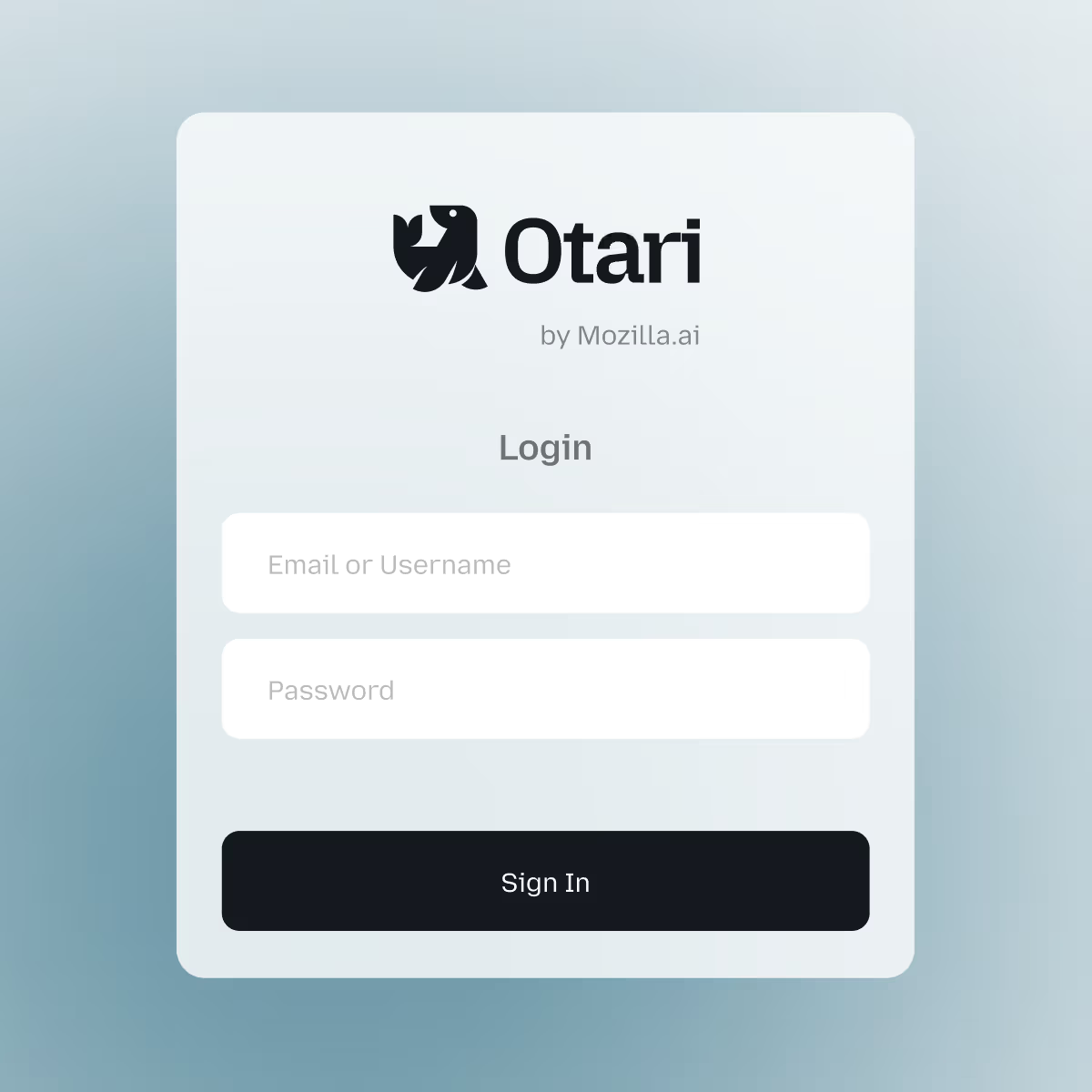
Logo design: A distinctive identity inspired by the otary, an eared seal, bringing personality and recognition to a complex technology product.
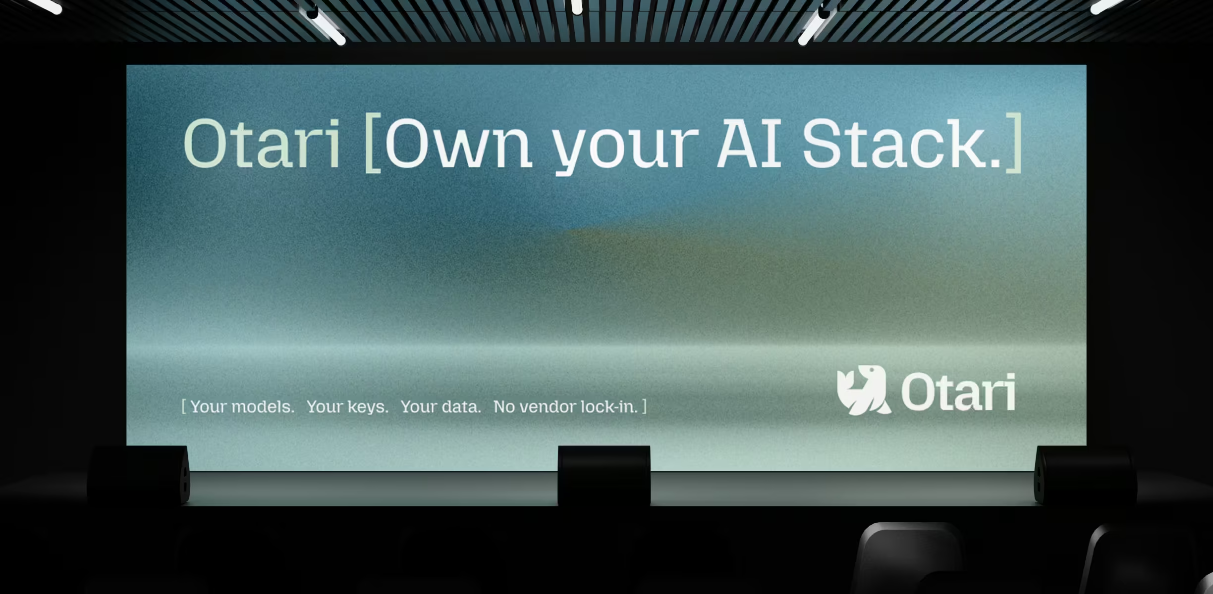
Colour palette: A considered colour system designed to communicate trust, clarity and confidence.
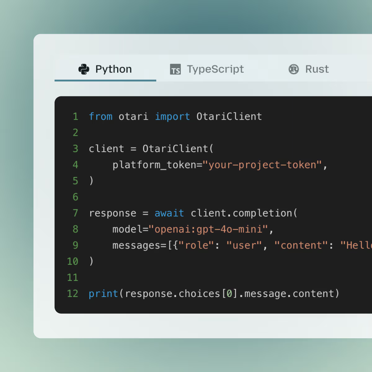
Visual language: A cohesive design direction balancing technological sophistication with a friendly, approachable character.
Brand guidelines: A set of visual principles and guidelines to ensure consistency across the platform and its communications.





You feel it too?
Let’s talk, no strings attached
And now you know Weedoo is right for you. Let's start up and scale your business - together.